Benchmarking is a good tool to understand what other organizations are doing, but it needs to be taken with a grain–or rather a pinch–of salt.
Originally a mark made by a surveyor on a landmark of known position and altitude, the term benchmark has come to mean a standard or point of reference against which to judge a specific value.
In business and operations, performance benchmarking has become a common process improvement tool. Understanding where our industry and peers stand with respect to key performance indicators (KPIs) is definitely valuable, but being naive about it and ignoring relationships among KPIs can be counterproductive, sending us out chasing chimeras.
What you Know and What you Don’t
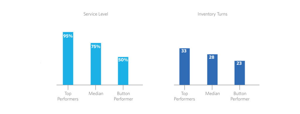
Benchmarking reports typically classify data in three groups: Top, Median and Bottom performers and a sense of direction is usually accepted: higher is better for profits, lower for costs. The charts below honor this idea showcasing higher inventory turns and service level on the top performing slots.

This is all good, and no one will deny that turning your inventory faster or keeping high service levels are good things to do–or aspire to. What the charts don’t tell us is if there is a relationship between those two metrics and if so, what it is. Should a company, based on the above data, aspire to turn its inventory 33 times and keep a service level of 95%?
The Underlying Data
In many cases, data is reported independently. Metrics are calculated using individual company information and then aggregated to preserve confidentiality. So the top performing inventory turns are simply those on the highest percentile of the full set of inventory turns values, without any additional structure. The same applies for service levels and most metrics we usually get our hands around.
A challenge is now evident: do the top values belong to the same set of companies? In many cases the answer is: not necessarily. The charts above were created using the synthetic data set in the table below (mischievously designed to exaggerate the effect!).

While viewed in isolation, 33 turns are better than 23 and a 95% service level is better than 50%. The table, however, tells a richer story. The best service level was offered by company C which managed to turn its inventory “only” 23 times. Company A on the other hand, turned its inventory more than anyone, but at a cost: dramatically lower service level.
Benchmark but Verify…
The moral of the story is that while benchmarking can help us get a sense of direction, we need to understand the limitations of the data as well as the operational trade-offs.
Looking at the underlying data relationships is probably the best way to understand it, but unfortunately that level of detail is not always available. So our best bet is to complement benchmarking with sound operational insights and a dose of that rare common sense.


